Application Development
SAGE3 supports two types of applications: Plugin Applications (developed externally and uploaded as a ZIP) and Integrated Applications (developed inside the SAGE3 source code). This page covers both.
Plugin Applications
Plugin apps are web applications developed outside the SAGE3 codebase and uploaded to a SAGE3 server. They run inside an isolated iframe on the board. Any web framework is supported (Vanilla JS, React, Vue, Svelte, etc.).
The optional @sage3/sageplugin npm package lets your plugin sync state across all connected users.
Key requirement: All asset paths in your index.html must be relative (e.g. ./script.js not /script.js), so the app loads correctly when hosted inside SAGE3.
Building a Plugin with TypeScript / Vite
- Create a new Vite project:
npm create vite@latest my-sage3-plugin
# Select: Vanilla → TypeScript (or any framework)
- Install and configure:
cd my-sage3-plugin
npm install
Create or update vite.config.ts to set relative paths and a consistent output folder:
import { defineConfig } from 'vite';

export default defineConfig({
  base: './',
  build: {
    outDir: './dist/sage3_plugin_app',
  },
});
- (Optional) Add the SAGE3 plugin library:
npm install @sage3/sageplugin
- Use the plugin API to sync state:
import { SAGE3Plugin } from '@sage3/sageplugin';

type MyState = { count: number };

const s3 = new SAGE3Plugin<MyState>();

// React to state changes from other users
s3.subscribeToUpdates((state) => {
  const count = state.data.state.count;
  document.getElementById('counter')!.innerText = String(count);
});

// Push a state update to all users
document.getElementById('increment')!.addEventListener('click', () => {
  const current = s3.state.data.state.count;
  s3.update({ state: { count: current + 1 } });
});
- Build:
npm run build
The output is in dist/sage3_plugin_app/. It must contain an index.html.
- ZIP the folder:
cd dist
zip -r my-sage3-plugin.zip sage3_plugin_app/
Building a Plugin with Plain JavaScript
No build step required. Create a folder with your HTML, CSS, and JS files. Use relative paths and load scripts as modules:
<script type="module" src="./index.js"></script>
Optionally, load the plugin library directly from a CDN:
import { SAGE3Plugin } from 'https://unpkg.com/@sage3/sageplugin@latest/src/lib/sageplugin.js';
ZIP the folder and upload.
Building a Unity WebGL Plugin
- Set Build Target to WebGL in Unity.
- Disable compression: Player Settings → Publishing Settings → Compression Format → Disabled.
- Build the project.
- ZIP the Build output folder.
- Upload (see below).
Uploading a Plugin
- Open SAGE3 and navigate to a board.
- Open the Plugin Menu from the main toolbar at the bottom and click Upload.

- Select your
.zipfile. Enter a name and description. Click Upload.

- If successful your plugin should be listed in the Plugins Menu.

- Click your Plugin to open an instance on the board.
Integrated Applications
Integrated apps are built directly into the SAGE3 source code and compiled into the main webapp bundle. They have full access to SAGE3 stores, hooks, and UI components — and appear alongside the built-in apps in the Applications panel.
Prerequisites
- Clone the repo and complete Development Setup
- Have the backend services and webstack running
Scaffolding a New App
From the webstack/ directory, run:
yarn newapp
Answer the prompts:
✔ App name: MyApp
✔ Developer name: Your Name
✔ State variable name: value
✔ Data type: number
✔ Default value: 0
This creates:
libs/applications/src/lib/apps/MyApp/
  MyApp.tsx      # AppComponent + ToolbarComponent
  index.ts       # Schema, initial state, display name
  styling.css    # App-specific CSS
The app is automatically registered in the app registry and will appear in the Applications panel in dev mode immediately (restart yarn webapp if it doesn't appear).
To reset or repair the app registry:
yarn regen
App File Structure
index.ts — Schema and Metadata
Defines the app's state shape using Zod, its default values, and its display name.
import { z } from 'zod';

export const schema = z.object({
  count: z.number(),
  // Add executeInfo if you want Python-side execution triggers
  executeInfo: z.object({
    executeFunc: z.string(),
    params: z.any(),
  }),
});
export type state = z.infer<typeof schema>;

export const init: Partial<state> = {
  count: 42,
  executeInfo: { executeFunc: '', params: {} },
};

export const name = 'Counter';
The four exports — schema, state, init, and name — are required. The generator adds your app to the shared apps.ts, types.ts, and initialValues.ts files automatically.
MyApp.tsx — React Components
Every app exports two components: AppComponent (the window) and ToolbarComponent (the toolbar shown below the app when selected). A GroupedToolbarComponent for multi-select actions is optional.
export default { AppComponent, ToolbarComponent, GroupedToolbarComponent };
Both components receive the full application element as a React prop (props: App) and return a JSX.Element. The prop includes the app's state, position, size, and the system-managed fields _id, _createdAt, _updatedAt, _updatedBy, and _createdBy.
App Schema Reference
Every SAGE3 app instance is stored in the apps collection with the following shape:
type AppSchema = {
  title: string;       // Display title in the app title bar
  roomId: string;      // Room the app belongs to
  boardId: string;     // Board the app is placed on
  position: { x: number; y: number; z: number };
  size: { width: number; height: number; depth: number };
  rotation: { x: number; y: number; z: number };
  type: AppName;       // e.g. 'Stickie', 'PDFViewer', 'Counter'
  state: AppState;     // Your app's custom state
  raised: boolean;     // Whether the app is raised above others
};
Every document in SAGEBase also gets these system-managed fields added automatically — do not write to them:
{
  _id: string;         // Unique identifier
  _createdAt: number;  // Unix timestamp (ms)
  _updatedAt: number;
  _createdBy: string;  // User ID
  _updatedBy: string;
}
Accessing State
Extract the typed state at the start of each component:
function AppComponent(props: App): JSX.Element {
  const s = props.data.state as AppState;
  // s.count is typed as number — hover in VSCode to inspect
}
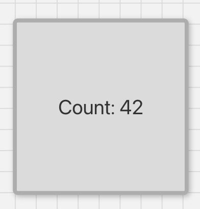
Wrapping your UI in AppWindow:
return (
  <AppWindow app={props}>
    <Box width="100%" height="100%" display="flex" alignItems="center" justifyContent="center">
      <Text fontSize="5xl">Count: {s.count}</Text>
    </Box>
  </AppWindow>
);
AppWindow handles window move/resize/scale and the app title bar. Always wrap your component in it.
Updating State
Use updateState from useAppStore. Only send the fields that changed — the update is merged with the existing state:
const updateState = useAppStore((state) => state.updateState);

updateState(props._id, { count: s.count + 1 });
Updates are broadcast to all connected users automatically. React re-renders when the updated state arrives back from the server.
Reacting to State Changes with useEffect
Run code once when the app mounts:
useEffect(() => {
  // Runs once when the component is first rendered
}, []);
Run code when a specific state field changes:
useEffect(() => {
  // Runs every time assetid changes on the server
}, [props.data.state.assetid]);
Important: Do not update SAGE3 state inside a
useEffectthat depends on SAGE3 state, or you will create an infinite update loop. Only update state in response to direct user actions (button clicks, input changes).
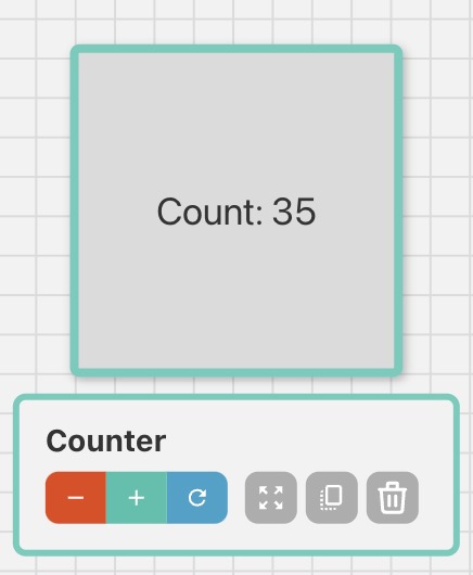
Toolbar
The toolbar appears below the app when it is selected. Put your most-used controls there. SAGE3 automatically adds Zoom, Duplicate, and Close buttons — your controls appear alongside them.
function ToolbarComponent(props: App): JSX.Element {
  const s = props.data.state as AppState;
  const updateState = useAppStore((state) => state.updateState);

  return (
    <ButtonGroup isAttached size="xs" colorScheme="teal">
      <Tooltip label="Decrease" placement="top" hasArrow openDelay={400}>
        <Button onClick={() => updateState(props._id, { count: s.count - 1 })}>
          <MdRemove />
        </Button>
      </Tooltip>
      <Tooltip label="Increase" placement="top" hasArrow openDelay={400}>
        <Button onClick={() => updateState(props._id, { count: s.count + 1 })}>
          <MdAdd />
        </Button>
      </Tooltip>
    </ButtonGroup>
  );
}
SAGE3 State vs. Local React State
This is the most important concept to internalize when building integrated apps:
SAGE3 State (updateState) | React Local State (useState) | |
|---|---|---|
| Storage | Redis — persisted on the server | In-memory — per client only |
| Sync | Broadcast to all connected users | Not shared |
| Use for | Anything that should be visible to other users | Loading indicators, local form values, UI-only toggles |
Never use useState for values that need to be shared. Never use updateState for values that are purely local UI state.
Creating Other Apps from Your App
const createApp = useAppStore((state) => state.create);

createApp({
  title: 'New Stickie',
  roomId: props.data.roomId,
  boardId: props.data.boardId,
  position: { x: props.data.position.x + props.data.size.width + 20, y: props.data.position.y, z: 0 },
  size: { width: 400, height: 300, depth: 0 },
  rotation: { x: 0, y: 0, z: 0 },
  type: 'Stickie',
  state: { text: 'Auto-created note', color: 'yellow', fontSize: 24, lock: false },
  raised: true,
});
Available Stores
Your app components import stores and hooks from @sage3/frontend. Here are the most commonly used:
import {
  useAppStore,      // CRUD on apps + updateState
  useUIStore,       // Board UI state: scale, position, selected app
  useAssetStore,    // Assets in the current room
  useUsersStore,    // All connected users
  usePresenceStore, // Live user cursors and viewports
  useConfigStore,   // Server configuration
  useUser,          // Current user profile
  useRouteNav,      // Navigation helpers
  useHotkeys,       // Register keyboard shortcuts
} from '@sage3/frontend';
AppStore
The primary store for working with apps on the board.
const createApp  = useAppStore((state) => state.create);
const updateApp  = useAppStore((state) => state.update);   // position/size/raised
const deleteApp  = useAppStore((state) => state.delete);
const updateState = useAppStore((state) => state.updateState); // your app's data
const duplicateApps = useAppStore((state) => state.duplicateApps);
const apps = useAppStore((state) => state.apps); // all apps on the board
Use updateState to change your app's data fields. Use updateApp to change position, size, or raised.
UIStore
Contains the current board's UI state — scale, viewport position, selected app, panel visibility, whiteboard settings, lasso state, and more.
// Current zoom level (1.0 = 100%)
const scale = useUIStore((state) => state.scale);

// Current board scroll position in board coordinates
const boardPosition = useUIStore((state) => state.boardPosition);

// The currently selected app's ID (empty string if none)
const selectedAppId = useUIStore((state) => state.selectedAppId);
The UIStore is defined in webstack/libs/frontend/src/lib/stores/ui.ts and is used internally by AppWindow and the board layers. Read from it freely; write to it only through its provided setters.
AssetStore
Provides access to all files uploaded to the current room.
const assets = useAssetStore((state) => state.assets);
Each asset has the following shape:
{
  file: string;            // Unique server filename (UUID-based)
  owner: string;           // User ID of uploader
  room: string;            // Room ID the file belongs to
  originalfilename: string; // Filename at upload time
  path: string;            // Server filesystem path
  dateCreated: string;     // ISO date string
  dateAdded: string;
  mimetype: string;        // MIME type
  destination: string;     // Server upload directory
  size: number;            // File size in bytes
  metadata?: string;       // Path to JSON metadata file (extracted via EXIFTool)
  derived?: ExtraImageData | ExtraPDFData; // Pre-processed data for viewers
}
The derived field is populated after upload and contains pre-processed data for the ImageViewer and PDFViewer:
// For images — multiple pre-generated resolutions
ExtraImageData = {
  fullSize: string;
  width: number;
  height: number;
  aspectRatio: number;
  filename: string;
  url: string;
  sizes: Array<{
    url: string;
    format: string;   // 'webp'
    size: number;
    width: number;
    height: number;
    channels: number;
    premultiplied: boolean;
  }>;
}

// For PDFs — array of pages, each page is an array of image resolutions
ExtraPDFData = Array<Array<ImageInfo>>;
To find a specific asset by ID:
const asset = assets.find((a) => a._id === props.data.state.assetid);
Python-Side Execution with executeInfo
If your app needs to trigger Python code in the Seer backend, include executeInfo in your schema. Set it from your toolbar or app UI:
updateState(props._id, {
  executeInfo: {
    executeFunc: 'my_python_function',
    params: { someParam: 'value' },
  },
});
In Seer, register a handler that watches for executeFunc changes and responds. See Development Setup — Seer for how to run the Seer service locally.
UI Library
SAGE3 uses Chakra UI v2 for styling. Use Chakra components (Box, Text, Button, Flex, etc.) and useColorModeValue for consistent light/dark theme behavior. Keep font sizes large enough to be readable on wall displays.
Adding New Packages
# In webstack/
yarn add <package-name>
yarn add -D @types/<package-name>   # if TypeScript types are needed
Then restart both yarn start and yarn webapp.
Reference: Complete Counter App
index.ts:
import { z } from 'zod';

export const schema = z.object({
  count: z.number(),
  executeInfo: z.object({ executeFunc: z.string(), params: z.any() }),
});
export type state = z.infer<typeof schema>;
export const init: Partial<state> = { count: 42, executeInfo: { executeFunc: '', params: {} } };
export const name = 'Counter';
Counter.tsx:
import { useAppStore } from '@sage3/frontend';
import { Box, Button, ButtonGroup, Text, Tooltip } from '@chakra-ui/react';
import { App } from '../../schema';
import { state as AppState } from './index';
import { AppWindow } from '../../components';
import { MdAdd, MdRemove } from 'react-icons/md';

function AppComponent(props: App): JSX.Element {
  const s = props.data.state as AppState;
  return (
    <AppWindow app={props}>
      <Box width="100%" height="100%" display="flex" alignItems="center" justifyContent="center">
        <Text fontSize="5xl">Count: {s.count}</Text>
      </Box>
    </AppWindow>
  );
}

function ToolbarComponent(props: App): JSX.Element {
  const s = props.data.state as AppState;
  const updateState = useAppStore((state) => state.updateState);
  return (
    <ButtonGroup isAttached size="xs" colorScheme="teal">
      <Tooltip label="Decrease" placement="top" hasArrow openDelay={400}>
        <Button onClick={() => updateState(props._id, { count: s.count - 1 })} size="xs" px={0}>
          <MdRemove size="16px" />
        </Button>
      </Tooltip>
      <Tooltip label="Increase" placement="top" hasArrow openDelay={400}>
        <Button onClick={() => updateState(props._id, { count: s.count + 1 })} size="xs" px={0}>
          <MdAdd size="16px" />
        </Button>
      </Tooltip>
    </ButtonGroup>
  );
}

const GroupedToolbarComponent = () => null;
export default { AppComponent, ToolbarComponent, GroupedToolbarComponent };